
How to Decorate with 2021 Color Trends

Everyone wants to live in a comfortable, functional, and beautiful home. You might be ready to give yours a visual facelift, but how do you get started? Once you know the color trends for 2021 and the proven designer tips for incorporating them, changing your home’s color palette is easier than you might think.
Top Trending Colors in 2021
Every year, the paint industry announces the latest color trends. This year’s selection reflects the emotions and desires of our time—peace, comfort, mindfulness, and hope for the future. From deep, rich tones to calming neutrals, here are the colors taking center stage in 2021:
- Yellow: This bright hue is meant to bring a little sunshine into your life after the tumultuous past year. Saffron and gold are jumping into the mix as well.
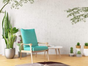
- Turquoise: Reminiscent of sea glass and ocean waves, turquoise provides a brilliant, exciting way to bring the outdoors inside.
- Magenta: Raspberry-toned magenta bears both warm and cool properties, meaning it pairs well with various neutrals.
- Gray: A soft, mid-tone gray is guaranteed to be a comforting, stable backdrop for your preferred accent color.
- Bronze: This contemporary, grounded neutral is gray with a hint of brown, lending an air of mindful reflection to any space.
Incorporating 2021 Color Trends into Your Home
Once you know what colors to work with, the next step is to implement them in aesthetically pleasing ways. Here are some designer tips to help you decorate with 2021 color trends:
- Choose a neutral backdrop and accent with pops of color: Even if you love bold colors, it’s wise to pick a neutral backdrop first. Then, add brightly colored artwork, vases, throw pillows, or accent chairs for pops of color. Consider choosing only one or two accent colors to use throughout the house for a pulled-together look.
- Use the 60-30-10 rule: This rule says a room’s colors should be 60% dominant (walls and floors), 30% secondary (upholstery), and 10% accent (accessories). This ratio is a safe way to ensure the proper balance, with just the right amount of pop.
- Use dark colors near the floor and lighter colors up high: Interior spaces feel the most natural when they mimic the outside world. To accomplish this, use the darkest colors on the floor (to replicate the earth), medium values at eye level (to imitate trees and buildings), and light shades on the ceiling (as if it were the sky).
Ready to give your home a new look? Home Consignment Center has the upscale home furnishings you want at an affordable price. Our California and Texas showrooms are bursting with interesting and exciting furniture, and new pieces come in all the time! From vintage to modern and everything in between, you are sure to find something that speaks to you. And if you need to make space, consider consigning your high-end furniture with us. Visit a Home Consignment Center near you today, and experience the thrill of the hunt for yourself.